
Georgina Cue
Q&A with Georgina Cue
10.12.20
Georgina Cue is a Melbourne-based artist. Her new body of work inspired by Picasso, Gaugin and Matisse will be exhibited at Gertrude Glasshouse for PHOTO 2021. Here she tells us about her inspirations and creating work that is materially ambiguous.
Hello Georgina, please start by telling us something about yourself that is not in your bio.
My name is Georgina Cue, I’m an artist and I currently lecture in the Painting Department at the Victorian College of the Arts.
What will you be exhibiting at PHOTO 2021?
I’ll be exhibiting a collection of large-scale photographs of openly constructed sets I built in my parent’s garage and in my studio. This show builds on my previous work, using ad hoc materials such as cardboard, masking tape and spray paint to create tableaux which reference cubist painting, Futurist film and modernist sculpture.
While my previous work has often included self-portraiture and performance, for this show I wanted to remove the figure so that I could experiment more with composition and colour using props and figurative painting. My aim was to create a series of photographs that serve as documentations of scenes and tableaux created through my sculptural practice.

Image: Georgina Cue, 'Untitled', 2020, archival Inkjet print, 114cm x 120cm
What inspired this project?
This project was inspired by 20th century still life paintings by Picasso, Gaugin and Matisse. At the beginning of this series, I wanted to experiment more with how I use colour in my own work. Similar to how a painter would approach a painting, I wanted to avoid using any pure blacks or whites for my coloured photographs. I adopted colour schemes used by Picasso and Matisse and then experimented with my own compositions by adding props such as ceramic vases and fabric.
For this series, I also produced a black and white photograph that was heavily inspired by the sets of Enrico Prampolini from a 1917 Italian Futurist film titled ‘Thais’. I loved how Prampolini used simple geometric shapes such as diamonds, chess pieces and spirals to create a surreal and graphics cinematic style. I adopted some Byzantine motifs used by Prampolini and combined them with elements from Jean Cocteau’s films, handwriting and drawings, such as ‘Blood of a Poet’.
I take a lot of inspiration from John Divola’s Zuma series, where he photographed wall paintings he created in abandoned houses on Zuma beach. I enjoy the way his work slips between different categories of painting, performance and photography. In a similar way I try to incorporate a performative element in my work, either by using myself physically in the work or through sculptural play. I hope my photographs can be read more as documentations of events rather than as a formal photograph.
How does it relate to the theme for PHOTO 2021: ‘The Truth’?
I’ve always had an interest in creating a type of artifice or visual effect then exposing the mechanisms of its production. I think this stems from my interest in film and theatre, and exploring different effects used in these areas. When I research other artworks and films, I’m often more drawn to images of the artist studio or behind the scenes footage of a scene.
For my work in PHOTO 2021, I wanted to create a series of photographs that are materially ambiguous when viewed from a distance. Only once the viewer gets closer to the photographs, they can then see the small flaws and cracks in the sets such as duct tape, torn cardboard or a footprint. I think my work becomes more interesting when I don’t try to disguise the processes involved in making it.
Can you tell us about the process of making this work?
Typically, I work best by imposing some constraints on myself. For this show I wanted to specifically focus on colour and composition, so I began by collecting images from early 20thcentury Futurist films and cubist still life paintings. I then selected which images I wanted to reference and began building sets. This process is very trial and error. I usually build up my sets by working from the background to the foreground. While I’m doing this, I take hundreds of photographs on my iPhone. I experiment with different compositions by placing props in various arrangements. I’m often surprised by how certain effects translate into a photograph. Something that looks quite flat in real life can become interesting once it’s mediated by a camera. After I’ve produced enough images, I then workshop backwards and select the ones that I think are the most successful.
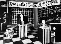
Image: Georgina Cue, Orpheus, 2020, Archival Inkjet Print, 114cm x 158cm
What do you hope audiences take from your work?
I try to use my sets as a way of creating new narratives that can provide different readings depending on the viewer. Art that interests me the most can be interpreted through multiple access points. I try to use simple visual elements like colour, form and scale to provide an access point for viewers not versed in Western art history. Beyond that, I hope that viewers with a literacy in art can pick up on some of the historical references I’ve adopted and re-assembled. I don’t see these references as a code to be cracked, but something that helps to give a richer experience of the work.
If your work at PHOTO 2021 was a song, what would it be?
I think it would be ‘On Sight’ from Kanye’s Yeezus album. I’ve been listening to this album a lot in the studio. But specifically, I think there are parallels between my work and the way Kanye mashes together different audio samples taken from a variety of historical sources including Hungarian rock to gospel music, and arranges them into new compositions.
Which other artists are you looking forward to seeing at PHOTO 2021?
I loved seeing Patrick Pounds work earlier this year as part of the expanded program. I love the way he projects ideas through the simple process of arranging and categorising found objects and photographs. I’m often drawn to artists who have a strong working relationship with history and archival imagery.
I’m also looking forward to seeing Justine Varga’s new work at Tolarno Galleries at PHOTO 2021.
And finally, what advice would you give to your 15 year old self?
I would say to go easier on myself.